Challenge
Aspen Collection needed a cohesive visual system for its apparel line. The early collection lacked a unified graphic language that could scale across categories, seasons, and retail environments.
Initiative
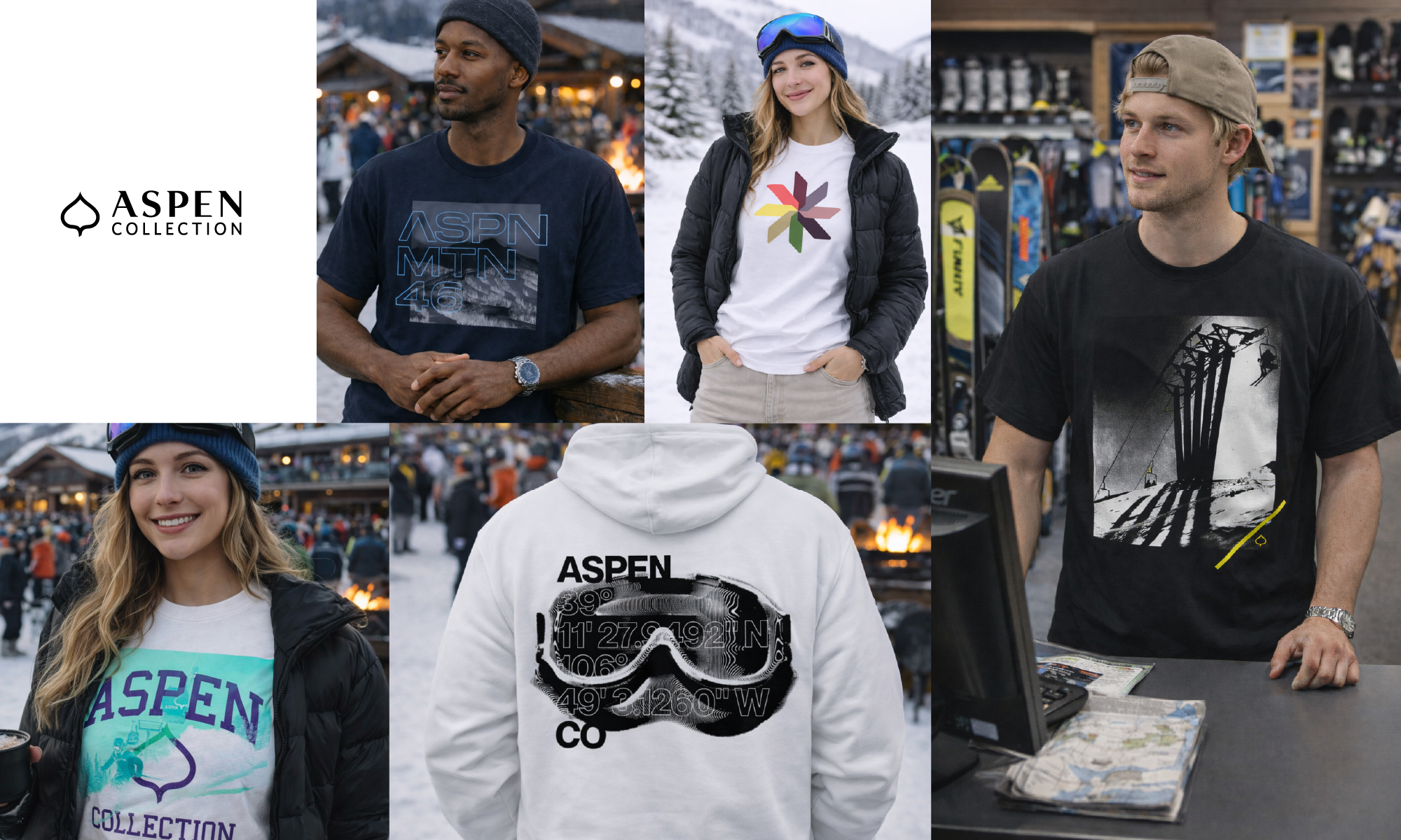
We created a complete apparel and graphics program:
Designed the core graphic system anchoring brand identity.
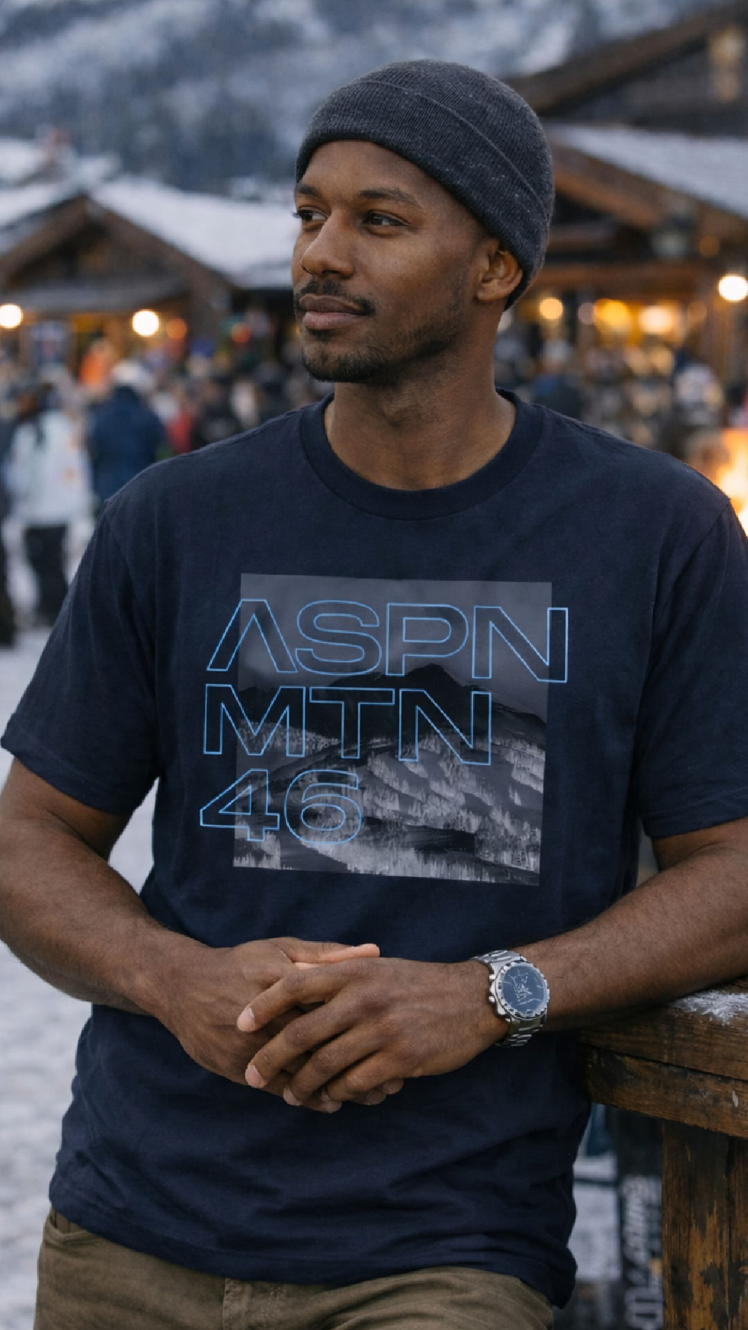
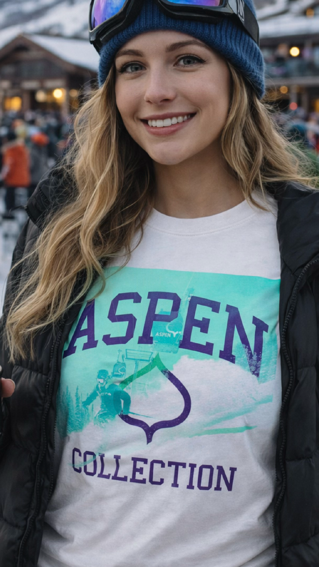
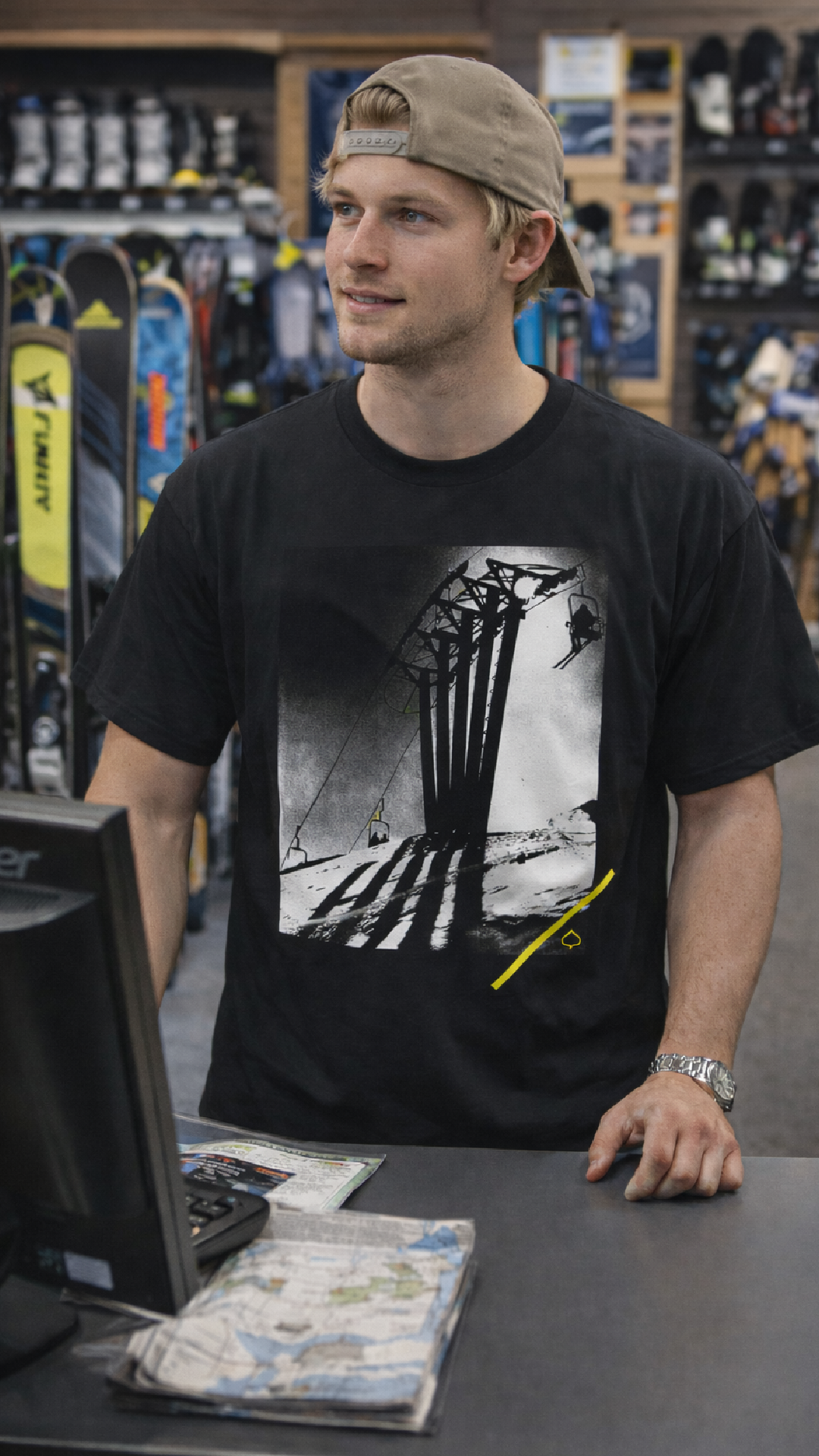
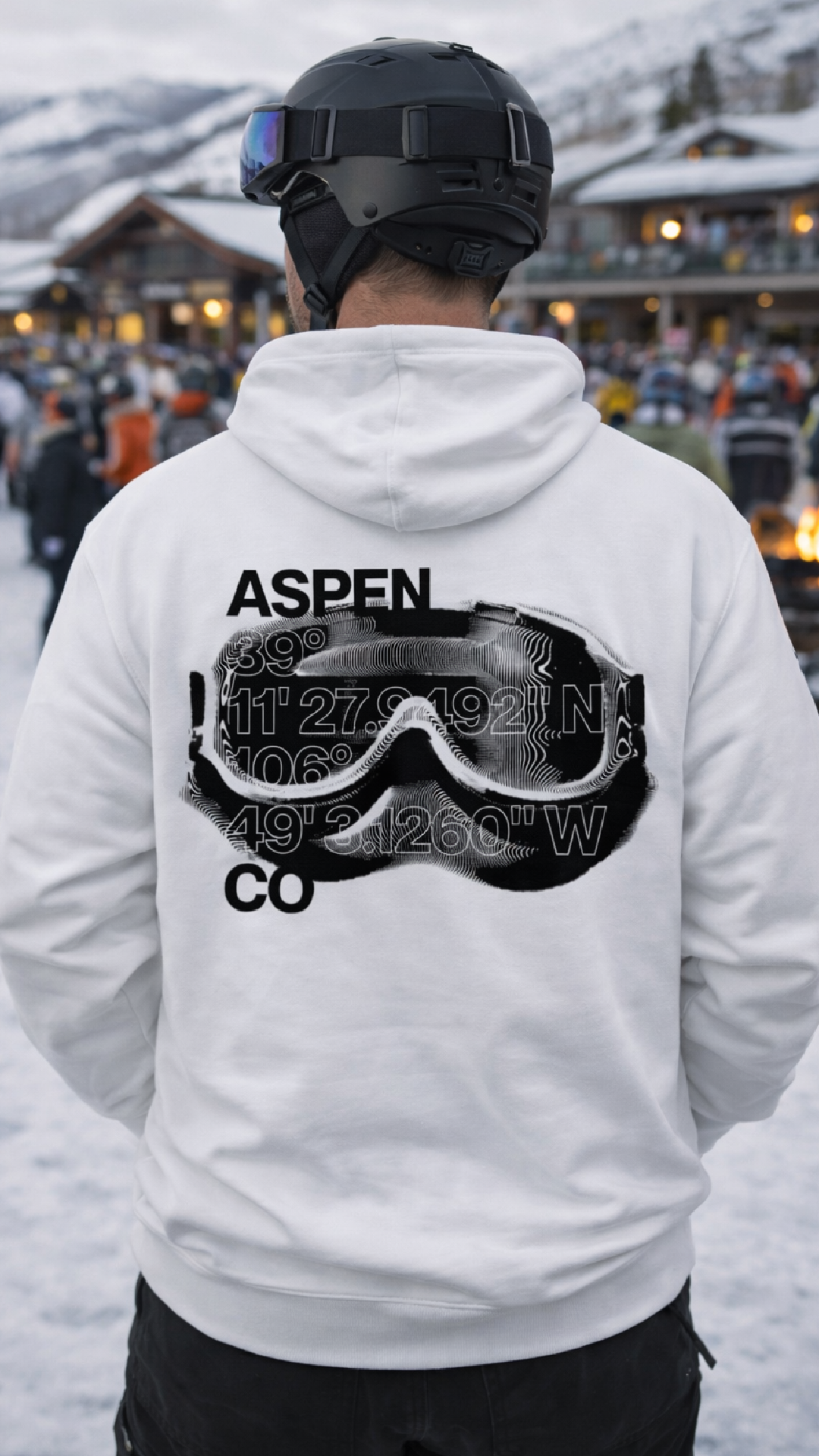
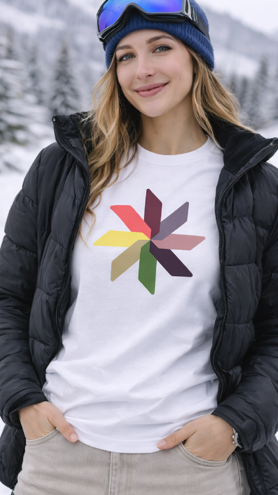
Built seasonal apparel capsules across tops, outerwear, accessories.
Developed placement graphics, typography, badges, trims, and packaging marks.
Standardized color, print, and application guidelines for production teams.
Context
Aspen was expanding into branded apparel tied to mountain culture and everyday life on the mountain. The system needed to work across lifestyle and technical products while remaining recognizable across men’s, women’s, and youth categories.
Design exploration drew from the physical environment around Aspen, including altitude references, topographic patterns, and mountain textures. The final direction balanced clean mountain modernism with heritage-inspired graphic marks that could scale across seasons.
Impact
A unified graphic language now used across all apparel categories.
Faster design-to-production cycles due to standardized assets.
Improved visual consistency across retail floorsets and digital merchandising.
Clearer brand recognition through repeatable motifs and structured tiers of graphics (core, seasonal, limited).